Vertically align an asterisk on a line
- Category: Cascading Stylesheets
- Hits: 26247
So I have an unordered list of values (*, 1, 2, 3...) and for styling reasons I want the asterisk to be the same size as the numbers but not overlap any list item beneath it. By increasing the size of the asterisk, this often increases the line-height and causes the overall line height to change for other objects in the same row. The problem afterwards was that the asterisk character would overlap the item beneath it (in this case #2) so when a user clicked on #2 they would in fact be clicking on the item containing the asterisk above it.
Objective
| Box List Before: | Box List After |
|
|
How?
CSS keeping the footer at the bottom
- Category: Cascading Stylesheets
- Hits: 23507
Aim:
| Header | |
Left | Right |
| Footer | |
<div id="container">
     <div id="header"></div>
     <div id="content">
          <div id="left"></div>
          <div id="right"></div>
          <div class="push"></div>
     </div>
     <div id="footer"></div>
</div>
SituationThe header displayed fine. The left and right columns finally got them side by side. But the footer that has a background image was under the left and right columns... The main content layer was overlapping the footer. I tried various z-index's bearing in mind that the footer has to be behind because the main content had a semi-transparent layer that overlapped it half-way.
I managed to fix this by including a div push layer which clears both (even though i had clear:both on the css for my #right div layer). For some reason, it has a more forceful effect in its own separate layer.
CSS Fieldset
- Category: Cascading Stylesheets
- Hits: 8445
fieldset label.inline { display: inline-block; margin-left: 2em; }
Change color of fieldset grouping line
fieldset { border: 2px ridge #7abcff; }
CSS Background Without Causing Scrollbars
- Category: Cascading Stylesheets
- Hits: 21789
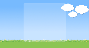
A Client had some clouds on the background of his photoshop file for his website. They were to be positioned in the top right corner with the leftmost tip aligned to the right of a central content section. I separated off the clouds as another div layer, specified the width and height and specified it's left. It caused the horizontal scrollbar which is a bit annoying because you scroll to the right and theres nothing but some background image. Also the footer was at 100% so it got cut off if you scrolled horizontally.
Aim / Objective
To have a background of sky and grass with a centered content section (white semi-transparent layer) of 900 pixels width as shown in the following picture:

And I want the clouds as another layer ontop aligned to the top right:

Page 2 of 2
Credit where Credit is Due:
Feel free to copy, redistribute and share this information. All that we ask is that you attribute credit and possibly even a link back to this website as it really helps in our search engine rankings.
Disclaimer: Please note that the information provided on this website is intended for informational purposes only and does not represent a warranty. The opinions expressed are those of the author only. We recommend testing any solutions in a development environment before implementing them in production. The articles are based on our good faith efforts and were current at the time of writing, reflecting our practical experience in a commercial setting.
Thank you for visiting and, as always, we hope this website was of some use to you!
Kind Regards,
Joel Lipman
www.joellipman.com


