
Another article on styling a radio group to become a weekly calendar carousel. In that a radio group displays the days of the week with arrows allowing the user to select the next or previous week. This is a follow on from my other articles on restyling Creator: Zoho Creator: Change Radio into Tabs and Zoho Creator: Decision Box into a Button.
Why?
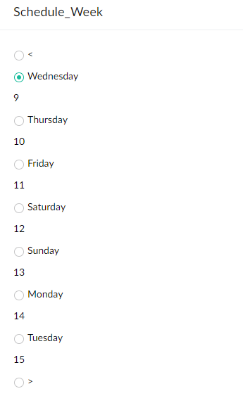
We can't include JavaScript in a ZohoCreator app without building a JS Widget or using Nodejs... Or we can make do with the tools provided. The brief was similar to the Zoho Bookings interface where their Creator app is to present the user with the days of the week which they can then click on to select a particular day. Some navigation is required in the form of a left arrow and right arrow to see previous or next weeks respectively.
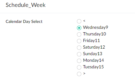
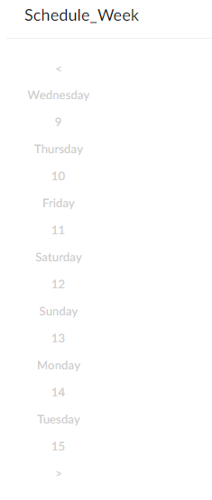
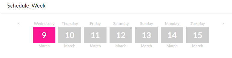
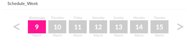
What I have:
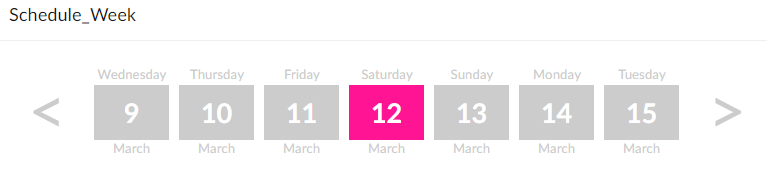
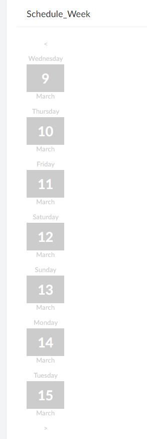
What I want:
How?
This was achieved using some CSS and then some Deluge for the functionality. Let's dig into the CSS and then I'll explain how we made this functional.
To prepare for this, I created the following Creator form:
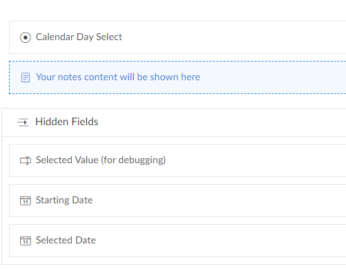
- The fields:
- Calendar Day Select (link name: Calendar_Day_Select || type Radio)
- Form CSS (link name: Form_Css || type Add Notes)
- Selected Value for debugging (link name: Selected_Value || type Single line)
- Starting Date (link name: Starting_Date || type Date)
- Selected Date (link name: Selected_Date || type Date)
The CSS
So first of all the value of each radio item will be populated using deluge and what's important to note here is that each picklist/dropdown option includes some HTML, specifically a SPAN tag surrounding the date number (eg. "Wednesday<span>9</span>March"), which yields the following:
Then I get rid of the label with the following CSS:
copyraw
label.zc-Calendar_Day_Select-label{display:none !important;}
- label.zc-Calendar_Day_Select-label{display:none !important;}
Then get rid of the round circles for radio inputs / and ensured the cursor remained as a hand to indicate clickable:
copyraw
div.zc-Calendar_Day_Select .choice-table-cell span label:nth-child(2){display:none;}
div.zc-Calendar_Day_Select .choice-table-cell span label:nth-child(3){cursor:pointer;}
- div.zc-Calendar_Day_Select .choice-table-cell span label:nth-child(2){display:none;}
- div.zc-Calendar_Day_Select .choice-table-cell span label:nth-child(3){cursor:pointer;}

Then I formatted the color of the text and set the general text font to be applied overall / included tweak to width so "Wednesday" will not wrap:
copyraw
div.zc-Calendar_Day_Select .choice-table-cell span label:nth-child(3){display:block;font-size:10pt;color:#ccc;text-align:center;}
div.zc-Calendar_Day_Select .choice-table-cell span label:nth-child(3){width:75px;}
- div.zc-Calendar_Day_Select .choice-table-cell span label:nth-child(3){display:block;font-size:10pt;color:#ccc;text-align:center;}
- div.zc-Calendar_Day_Select .choice-table-cell span label:nth-child(3){width:75px;}
Then I format the value within the span to make the date more prominent:
copyraw
div.zc-Calendar_Day_Select .choice-table-cell span label:nth-child(3) span{display:block;font-size:20pt;font-weight:bold;color:#fff;background-color:#ccc;text-align:center;padding-bottom:5px;}
- div.zc-Calendar_Day_Select .choice-table-cell span label:nth-child(3) span{display:block;font-size:20pt;font-weight:bold;color:#fff;background-color:#ccc;text-align:center;padding-bottom:5px;}
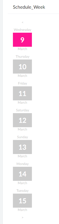
I want to highlight the current selection so I'll make this a different color (hot pink):
copyraw
div.zc-Calendar_Day_Select .choice-table-cell span label:nth-child(3)[elname='radioEl_zc-Calendar_Day_Select_2'] span{background-color:#FF1493 !important;}
- div.zc-Calendar_Day_Select .choice-table-cell span label:nth-child(3)[elname='radioEl_zc-Calendar_Day_Select_2'] span{background-color:#FF1493 !important;}
Then I want to align these boxes horizontally and not vertically:
copyraw
div.zc-Calendar_Day_Select .choice-table-cell{float:left}
div.zc-Calendar_Day_Select .choice-table-row{float:left}
- div.zc-Calendar_Day_Select .choice-table-cell{float:left}
- div.zc-Calendar_Day_Select .choice-table-row{float:left}
And finally, I want to make the chevrons (less than and greater than sign) massive:
copyraw
div.zc-Calendar_Day_Select .choice-table-cell span label[elname='radioEl_zc-Calendar_Day_Select_1']{font-size:65px}
div.zc-Calendar_Day_Select .choice-table-cell span label[elname='radioEl_zc-Calendar_Day_Select_9']{font-size:65px}
- div.zc-Calendar_Day_Select .choice-table-cell span label[elname='radioEl_zc-Calendar_Day_Select_1']{font-size:65px}
- div.zc-Calendar_Day_Select .choice-table-cell span label[elname='radioEl_zc-Calendar_Day_Select_9']{font-size:65px}
Awesome! Looking good!
the Deluge
Not just a pretty face, let's make this functional. First of all, make sure you set up a form with the fields I mentioned earlier in the Creator form. Here's the code which should happen when the form containing this radio field loads up:
copyraw
//
// initial CSS (hide element while it is styled)
input.Form_Css = "<style>div.zc-Calendar_Day_Select-group{display:none}</style>";
//
// set initial hidden date field
input.Selected_Date = zoho.currentdate;
input.Starting_Date = zoho.currentdate;
//
// set the values for the calendar select field
clear Calendar_Day_Select;
input.Calendar_Day_Select:ui.add("<");
for each index v_DateIndex in {1,2,3,4,5,6,7}
{
input.Calendar_Day_Select:ui.add(zoho.currentdate.addDay(v_DateIndex).toString("EEEE") + "<span>" + zoho.currentdate.addDay(v_DateIndex).toString("d") + "</span>" + zoho.currentdate.addDay(v_DateIndex).toString("MMMM"));
}
input.Calendar_Day_Select:ui.add(">");
//
// default selected to current date (triggers the next code snippet / workflow on user input of "calendar day select")
v_PreselectedValue = zoho.currentdate.toString("EEEE") + "<span>" + zoho.currentdate.toString("d") + "</span>" + zoho.currentdate.addDay(v_DateIndex).toString("MMMM");
input.Calendar_Day_Select = v_PreselectedValue;
//
// hide (comment this out if you are still debugging)
hide Hidden_Fields;
- //
- // initial CSS (hide element while it is styled)
- input.Form_Css = "<style>div.zc-Calendar_Day_Select-group{display:none}</style>";
- //
- // set initial hidden date field
- input.Selected_Date = zoho.currentdate;
- input.Starting_Date = zoho.currentdate;
- //
- // set the values for the calendar select field
- clear Calendar_Day_Select;
- input.Calendar_Day_Select:ui.add("<");
- for each index v_DateIndex in {1,2,3,4,5,6,7}
- {
- input.Calendar_Day_Select:ui.add(zoho.currentdate.addDay(v_DateIndex).toString("EEEE") + "<span>" + zoho.currentdate.addDay(v_DateIndex).toString("d") + "</span>" + zoho.currentdate.addDay(v_DateIndex).toString("MMMM"));
- }
- input.Calendar_Day_Select:ui.add(">");
- //
- // default selected to current date (triggers the next code snippet / workflow on user input of "calendar day select")
- v_PreselectedValue = zoho.currentdate.toString("EEEE") + "<span>" + zoho.currentdate.toString("d") + "</span>" + zoho.currentdate.addDay(v_DateIndex).toString("MMMM");
- input.Calendar_Day_Select = v_PreselectedValue;
- //
- // hide (comment this out if you are still debugging)
- hide Hidden_Fields;
Then we need a workflow/trigger that runs whenever a user clicks on one of these date boxes (On User input of Calendar Day Select). The key to remember here is that it isn't a week commencing date but more like the today's date minus 7 or plus 7 days depending on which way they navigate. We then need the offset so that when a user clicks on the #9 entry, the system will know this is March 9th 2022 and not June 9th 2021... To do this, we have 2 date fields which will be hidden to the user but displayed here for testing purposes: the starting date, and then based on the offset, the selected date.
The first bit of this snippet creates a map which for this example would be {"9":1,"10":2,"11":3,"12":4,"13":5,"14":6,"15":7}. This means that if I click on Tuesday<span>10</span>March, this code will match "10" to the map and determine what index or offset this is from the starting date, which is "2". It can then determine which CSS element to highlight in a different CSS color, and which date to enter into the Selected_Date field:
copyraw
But wait we're not finished as there are the chevrons / less-than greater-than signs options to program into. For this simply append the following:
// creating map for offset (determine which CSS box was selected)
m_Offset = Map();
v_StartDate = input.Starting_Date;
v_RefIndex = 0;
for each  v_Offset in {1,2,3,4,5,6,7}
{
	v_RefIndex = v_Offset - 1;
	m_Offset.put(v_StartDate.toDate().addDay(v_RefIndex).toString("d"),v_Offset);
}
input.Selected_Value = input.Calendar_Day_Select;
v_DateOffset = m_Offset.get(input.Calendar_Day_Select.replaceAll("[^0-9]",""));
//
// if a number was selected, ie. not chevrons
if(v_DateOffset >= 0)
{
	//
	// set selected date field value
	input.Selected_Date = input.Starting_Date.addDay(v_DateOffset - 1);
	v_CssIndex = v_DateOffset + 1;
	//
	// Inject some CSS
	v_Css = "<style>";
	// get rid of field label
	v_Css = v_Css + "label.zc-Calendar_Day_Select-label{display:none !important;}";
	// get rid of circle radio inputs
	v_Css = v_Css + "div.zc-Calendar_Day_Select .choice-table-cell span label:nth-child(2){display:none;}";
	// make cursor into hand (to indicate clickable)
	v_Css = v_Css + "div.zc-Calendar_Day_Select .choice-table-cell span label:nth-child(3){cursor:pointer;}";
	// format overall text (the day name)
	v_Css = v_Css + "div.zc-Calendar_Day_Select .choice-table-cell span label:nth-child(3){display:block;font-size:10pt;color:#ccc;text-align:center;}";
	// set width so that Wednesday does not wrap
	v_Css = v_Css + "div.zc-Calendar_Day_Select .choice-table-cell span label:nth-child(3){width:75px;}";
	// format value within span
	v_Css = v_Css + "div.zc-Calendar_Day_Select .choice-table-cell span label:nth-child(3) span{display:block;font-size:20pt;font-weight:bold;color:#fff;background-color:#ccc;text-align:center;padding-bottom:5px;}";
	// format selected box (the one that was clicked)
	v_Css = v_Css + "div.zc-Calendar_Day_Select .choice-table-cell span label:nth-child(3)[elname='radioEl_zc-Calendar_Day_Select_" + v_CssIndex + "'] span{background-color:#FF1493 !important;}";
	// make boxes align horizontally instead of vertically
	v_Css = v_Css + "div.zc-Calendar_Day_Select .choice-table-cell{float:left}";
	v_Css = v_Css + "div.zc-Calendar_Day_Select .choice-table-row{float:left}";
	// format chevrons
	v_Css = v_Css + "div.zc-Calendar_Day_Select .choice-table-cell span label[elname='radioEl_zc-Calendar_Day_Select_1']{font-size:65px}";
	v_Css = v_Css + "div.zc-Calendar_Day_Select .choice-table-cell span label[elname='radioEl_zc-Calendar_Day_Select_9']{font-size:65px}";
	v_Css = v_Css + "</style>";
	input.Form_Css = v_Css;
}
- // creating map for offset (determine which CSS box was selected)
- m_Offset = Map();
- v_StartDate = input.Starting_Date;
- v_RefIndex = 0;
- for each v_Offset in {1,2,3,4,5,6,7}
- {
- v_RefIndex = v_Offset - 1;
- m_Offset.put(v_StartDate.toDate().addDay(v_RefIndex).toString("d"),v_Offset);
- }
- input.Selected_Value = input.Calendar_Day_Select;
- v_DateOffset = m_Offset.get(input.Calendar_Day_Select.replaceAll("[^0-9]",""));
- //
- // if a number was selected, ie. not chevrons
- if(v_DateOffset >= 0)
- {
- //
- // set selected date field value
- input.Selected_Date = input.Starting_Date.addDay(v_DateOffset - 1);
- v_CssIndex = v_DateOffset + 1;
- //
- // Inject some CSS
- v_Css = "<style>";
- // get rid of field label
- v_Css = v_Css + "label.zc-Calendar_Day_Select-label{display:none !important;}";
- // get rid of circle radio inputs
- v_Css = v_Css + "div.zc-Calendar_Day_Select .choice-table-cell span label:nth-child(2){display:none;}";
- // make cursor into hand (to indicate clickable)
- v_Css = v_Css + "div.zc-Calendar_Day_Select .choice-table-cell span label:nth-child(3){cursor:pointer;}";
- // format overall text (the day name)
- v_Css = v_Css + "div.zc-Calendar_Day_Select .choice-table-cell span label:nth-child(3){display:block;font-size:10pt;color:#ccc;text-align:center;}";
- // set width so that Wednesday does not wrap
- v_Css = v_Css + "div.zc-Calendar_Day_Select .choice-table-cell span label:nth-child(3){width:75px;}";
- // format value within span
- v_Css = v_Css + "div.zc-Calendar_Day_Select .choice-table-cell span label:nth-child(3) span{display:block;font-size:20pt;font-weight:bold;color:#fff;background-color:#ccc;text-align:center;padding-bottom:5px;}";
- // format selected box (the one that was clicked)
- v_Css = v_Css + "div.zc-Calendar_Day_Select .choice-table-cell span label:nth-child(3)[elname='radioEl_zc-Calendar_Day_Select_" + v_CssIndex + "'] span{background-color:#FF1493 !important;}";
- // make boxes align horizontally instead of vertically
- v_Css = v_Css + "div.zc-Calendar_Day_Select .choice-table-cell{float:left}";
- v_Css = v_Css + "div.zc-Calendar_Day_Select .choice-table-row{float:left}";
- // format chevrons
- v_Css = v_Css + "div.zc-Calendar_Day_Select .choice-table-cell span label[elname='radioEl_zc-Calendar_Day_Select_1']{font-size:65px}";
- v_Css = v_Css + "div.zc-Calendar_Day_Select .choice-table-cell span label[elname='radioEl_zc-Calendar_Day_Select_9']{font-size:65px}";
- v_Css = v_Css + "</style>";
- input.Form_Css = v_Css;
- }
copyraw
else if(input.Calendar_Day_Select == "<")
{
//
// set selected date field value
input.Selected_Date = input.Starting_Date.subDay(7);
input.Starting_Date = input.Starting_Date.subDay(7);
//
// set the values for the calendar select field
clear Calendar_Day_Select;
input.Calendar_Day_Select:ui.add("<");
for each index v_DateIndex in {1,2,3,4,5,6,7}
{
input.Calendar_Day_Select:ui.add(input.Selected_Date.addDay(v_DateIndex).toString("EEEE") + "<span>" + input.Selected_Date.addDay(v_DateIndex).toString("d") + "</span>" + input.Selected_Date.addDay(v_DateIndex).toString("MMMM"));
}
input.Calendar_Day_Select:ui.add(">");
v_PreselectedValue = input.Selected_Date.toString("EEEE") + "<span>" + input.Selected_Date.toString("d") + "</span>" + input.Selected_Date.addDay(v_DateIndex).toString("MMMM");
input.Calendar_Day_Select = v_PreselectedValue;
}
else if(input.Calendar_Day_Select == ">")
{
//
// set selected date field value
input.Selected_Date = input.Starting_Date.addDay(7);
input.Starting_Date = input.Starting_Date.addDay(7);
//
// set the values for the calendar select field
clear Calendar_Day_Select;
input.Calendar_Day_Select:ui.add("<");
for each index v_DateIndex in {1,2,3,4,5,6,7}
{
input.Calendar_Day_Select:ui.add(input.Selected_Date.addDay(v_DateIndex).toString("EEEE") + "<span>" + input.Selected_Date.addDay(v_DateIndex).toString("d") + "</span>" + input.Selected_Date.addDay(v_DateIndex).toString("MMMM"));
}
input.Calendar_Day_Select:ui.add(">");
v_PreselectedValue = input.Selected_Date.toString("EEEE") + "<span>" + input.Selected_Date.toString("d") + "</span>" + input.Selected_Date.addDay(v_DateIndex).toString("MMMM");
input.Calendar_Day_Select = v_PreselectedValue;
}
- else if(input.Calendar_Day_Select == "<")
- {
- //
- // set selected date field value
- input.Selected_Date = input.Starting_Date.subDay(7);
- input.Starting_Date = input.Starting_Date.subDay(7);
- //
- // set the values for the calendar select field
- clear Calendar_Day_Select;
- input.Calendar_Day_Select:ui.add("<");
- for each index v_DateIndex in {1,2,3,4,5,6,7}
- {
- input.Calendar_Day_Select:ui.add(input.Selected_Date.addDay(v_DateIndex).toString("EEEE") + "<span>" + input.Selected_Date.addDay(v_DateIndex).toString("d") + "</span>" + input.Selected_Date.addDay(v_DateIndex).toString("MMMM"));
- }
- input.Calendar_Day_Select:ui.add(">");
- v_PreselectedValue = input.Selected_Date.toString("EEEE") + "<span>" + input.Selected_Date.toString("d") + "</span>" + input.Selected_Date.addDay(v_DateIndex).toString("MMMM");
- input.Calendar_Day_Select = v_PreselectedValue;
- }
- else if(input.Calendar_Day_Select == ">")
- {
- //
- // set selected date field value
- input.Selected_Date = input.Starting_Date.addDay(7);
- input.Starting_Date = input.Starting_Date.addDay(7);
- //
- // set the values for the calendar select field
- clear Calendar_Day_Select;
- input.Calendar_Day_Select:ui.add("<");
- for each index v_DateIndex in {1,2,3,4,5,6,7}
- {
- input.Calendar_Day_Select:ui.add(input.Selected_Date.addDay(v_DateIndex).toString("EEEE") + "<span>" + input.Selected_Date.addDay(v_DateIndex).toString("d") + "</span>" + input.Selected_Date.addDay(v_DateIndex).toString("MMMM"));
- }
- input.Calendar_Day_Select:ui.add(">");
- v_PreselectedValue = input.Selected_Date.toString("EEEE") + "<span>" + input.Selected_Date.toString("d") + "</span>" + input.Selected_Date.addDay(v_DateIndex).toString("MMMM");
- input.Calendar_Day_Select = v_PreselectedValue;
- }
Category: Zoho :: Article: 808


Add comment