What?
So this is a quick article to demo how to center an iframe horizontally and vertically in a screen/viewport in pure CSS (no JavaScript allowed). This CSS centers it by its center point rather than the top/bottom/left/right outline.

Why?
On a mobile, a client's site uses an external page embedded by iframe. When the app within the iframe has an alert message, it popups a div at the centre of its app. The alert message is always at the center of the iframe but if the iframe has a height of 2000 pixels, the iframe gets aligned to the top of the parent...

How?
We're going to use a touch of CSS and instead of determining heights and alignment with JS.

What?
A quick article to remind me on how create an multi-level ordered list that indents and aligns correctly.

Why?
I'm finding that I need to do this quite often for some clients who want to include their terms and conditions in quote/invoice templates and want the HTML to be indented neatly.

Other examples out there will work, but I found that once the list count increased the number of digits (eg. 1.10) the text would be more indented (relative) to 1.1. I need all list elements to be all perfectly aligned.
copyraw
// What I Have

1.   Item 1
     1.1   Item 1a
     1.2   Item 1b
     ... 
     1.9   Item 1c
     1.10   Item 1d
2.   Item 2
  1.  // What I Have 
  2.   
  3.  1.   Item 1 
  4.       1.1   Item 1a 
  5.       1.2   Item 1b 
  6.       ... 
  7.       1.9   Item 1c 
  8.       1.10   Item 1d 
  9.  2.   Item 2 
copyraw
// What I Want

1.   Item 1
     1.1   Item 1a
     1.2   Item 1b
     ... 
     1.9   Item 1c
     1.10  Item 1d
2.   Item 2
  1.  // What I Want 
  2.   
  3.  1.   Item 1 
  4.       1.1   Item 1a 
  5.       1.2   Item 1b 
  6.       ... 
  7.       1.9   Item 1c 
  8.       1.10  Item 1d 
  9.  2.   Item 2 
copyraw
// What I DON'T Want  (happens if you use list-style-position: outside)

1.   Item 1
      1.1  Item 1a
      1.2  Item 1b
      ... 
      1.9  Item 1c
     1.10  Item 1d
2.   Item 2
  1.  // What I DON'T Want  (happens if you use list-style-position: outside) 
  2.   
  3.  1.   Item 1 
  4.        1.1  Item 1a 
  5.        1.2  Item 1b 
  6.        ... 
  7.        1.9  Item 1c 
  8.       1.10  Item 1d 
  9.  2.   Item 2 

How?
I've been refining this based on several examples and the following solution seems to be the most stable:
Category: Cascading Stylesheets :: Article: 686

What?
This is an article I hope to refine one day where given a set of breadcrumb hyperlinks, when I hover the mouse over the links, the text changes and the transition between the two is controlled smoothly.

Why?
At time of print, I couldn't find any clear example demonstrating this so here's my take on it:

What I have
copyraw
» Home / Products / Lanterns
  1.  » Home / Products / Lanterns 
What I want (on mouseover)
copyraw
// if I hover the mouse over the "Home" link:
» Return to Home / Products / Lanterns        

// if I hover the mouse over the "Products" link:
» Home / More Products / Lanterns        

// if I hover the mouse over the "Lanterns" link:
» Home / Products / More Lanterns
  1.  // if I hover the mouse over the "Home" link: 
  2.  » Return to Home / Products / Lanterns 
  3.   
  4.  // if I hover the mouse over the "Products" link: 
  5.  » Home / More Products / Lanterns 
  6.   
  7.  // if I hover the mouse over the "Lanterns" link: 
  8.  » Home / Products / More Lanterns 

How?
Category: Cascading Stylesheets :: Article: 680

What?
I saw a lot of articles that would cover this but I wanted an example which includes headers and footers and how to get an automatic page-break-inside to not overlap these. Fine on screen but this is obviously for when it comes to printing.

Why?
I needed to create a template in HTML where the first page is a cover page (background image filling the page with a logo floating at the centre) and the next page has a table which is of variable length. Fine when the table was short and didn't have many rows. But the client will pick up the phone to you when the table has too many rows to fit on one page, and this overlaps onto the next, covering the footer and header...

How?
By spending a lot of time spinning on my chair and twiddling my thumbs...

Applies to:
  • CSS
  • HTML
What?
A quick article on how to get a div layer to increase height based on how a heading fits on a page.

What?
I have a heading like this:
The heading in full width
The code of this is:
copyraw
<div id="page-title" class="col-xs-12">
	<h1><a href="/">A long heading that wraps over several lines</a></h1>
</div>
  1.  <div id="page-title" class="col-xs-12"> 
  2.      <h1><a href="/">A long heading that wraps over several lines</a></h1> 
  3.  </div> 
Category: Cascading Stylesheets :: Article: 646

What?
So many people asking this when the solution is a bit of aesthetic styling.
copyraw
ol{margin:4px}

-- yields
995.
996.
997.
998.
999.
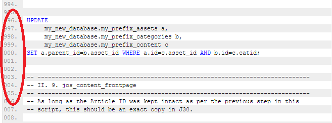
000.      <-- What's going on here then?
001.
002.
  1.  ol{margin:4px} 
  2.   
  3.  -- yields 
  4.  995
  5.  996
  6.  997
  7.  998
  8.  999
  9.  000.      <-- What's going on here then? 
  10.  001
  11.  002
Or check out this screenshot of the issue:
Ordered List Issue

How?
Category: Cascading Stylesheets :: Article: 485

What?
So this is an article to note an oddity when I was working with a Yootheme template called "yoo_sync". Some clever scripts (both mootools and jquery) using the equalize method to make div layers the same height, and in this case, the same width. It isn't so much a miscalculation of 100% divided by 3 that leaves 1 pixel left over, more the fact that the scripts use that 1 pixel (ceiling rather than floor?).

Why?
We have a row on a website of three boxes made of div layers. When viewed normally on a 15" Laptop, all was good using Chrome and tolerable using MS Internet Explorer. If we maximized the Google Chrome browser, the row would split and there would be 2 boxes on the top row and the third would pop under these. As for MSIE, that was ok when maximized.

How?
You could do loads of code hacks which is what I tested but all for nothing because you always end up needing to specify a third of the width.

What?
This is a quick article on how to resolve the following issue:
  • Overall body background color is blue.
  • Background color of my contents is white.
  • When I visit a small page on the site, the contents background (white) shows.
  • When I visit a very long page on the site, the contents background disappears and reveals the overall background (blue) making the text very hard to read.

Why?
Took me a while to figure out what was the problem, I'd visit some pages and they'd be fine, but when visiting a long page, it would initially display properly but then the white background would disappear when the page finally loaded.

How?

What?
So I have an unordered list of values (*, 1, 2, 3...) and for styling reasons I want the asterisk to be the same size as the numbers but not overlap any list item beneath it. By increasing the size of the asterisk, this often increases the line-height and causes the overall line height to change for other objects in the same row. The problem afterwards was that the asterisk character would overlap the item beneath it (in this case #2) so when a user clicked on #2 they would in fact be clicking on the item containing the asterisk above it.

Objective
Box List Before:Box List After
  • *
  • 1
  • 2
  • 3
  • *
  • 1
  • 2
  • 3

How?

Spent enough time trying different methods across the web but only 1 article worked for me using the "push" div layer. Loosely based on Ryanfait: Make a Footer Stick to the Bottom of the Page

Aim:
Header

Left


Right

Footer
copyraw
<div id="container">
     <div id="header"></div>
     <div id="content">
          <div id="left"></div>
          <div id="right"></div>
          <div class="push"></div>
     </div>
     <div id="footer"></div>
</div>
  1.  <div id="container"> 
  2.       <div id="header"></div> 
  3.       <div id="content"> 
  4.            <div id="left"></div> 
  5.            <div id="right"></div> 
  6.            <div class="push"></div> 
  7.       </div> 
  8.       <div id="footer"></div> 
  9.  </div> 
Situation
The header displayed fine. The left and right columns finally got them side by side. But the footer that has a background image was under the left and right columns... The main content layer was overlapping the footer. I tried various z-index's bearing in mind that the footer has to be behind because the main content had a semi-transparent layer that overlapped it half-way.

I managed to fix this by including a div push layer which clears both (even though i had clear:both on the css for my #right div layer). For some reason, it has a more forceful effect in its own separate layer.

Category: Cascading Stylesheets :: Article: 350

Add horizontal space between label and fieldset
copyraw
fieldset label.inline { display: inline-block; margin-left: 2em; }
  1.  fieldset label.inline { display: inline-block; margin-left: 2em} 


Change color of fieldset grouping line
copyraw
fieldset { border: 2px ridge #7abcff; }
  1.  fieldset { border: 2px ridge #7abcff; } 
Category: Cascading Stylesheets :: Article: 349

Quick note in case I spend as long as I did again.

A Client had some clouds on the background of his photoshop file for his website. They were to be positioned in the top right corner with the leftmost tip aligned to the right of a central content section. I separated off the clouds as another div layer, specified the width and height and specified it's left. It caused the horizontal scrollbar which is a bit annoying because you scroll to the right and theres nothing but some background image. Also the footer was at 100% so it got cut off if you scrolled horizontally.

Aim / Objective
To have a background of sky and grass with a centered content section (white semi-transparent layer) of 900 pixels width as shown in the following picture:
background of sky and grass with a centered content section (no clouds)

And I want the clouds as another layer ontop aligned to the top right:
background of sky and grass with a centered content section (with clouds)


Credit where Credit is Due:


Feel free to copy, redistribute and share this information. All that we ask is that you attribute credit and possibly even a link back to this website as it really helps in our search engine rankings.

Disclaimer: Please note that the information provided on this website is intended for informational purposes only and does not represent a warranty. The opinions expressed are those of the author only. We recommend testing any solutions in a development environment before implementing them in production. The articles are based on our good faith efforts and were current at the time of writing, reflecting our practical experience in a commercial setting.

Thank you for visiting and, as always, we hope this website was of some use to you!

Kind Regards,

Joel Lipman
www.joellipman.com

RSS Feed

Related Articles

Joes Revolver Map

Joes Word Cloud

joomla   used   value   client   using   error   code   where   creator   mysql   report   first   order   website   date   database   case   added   need   following   name   version   table   data   script   field   display   list   windows   function   time   deluge   zoho   files   work   source   find   user   create   license   parameter   google   file   form   uploaded   would   system   page   server   note   JoelLipman.Com

Accreditation

Badge - Certified Zoho Creator Associate

Donate & Support

If you like my content, and would like to support this sharing site, feel free to donate using a method below:

Paypal:
Donate to Joel Lipman via PayPal

Bitcoin:
Donate to Joel Lipman with Bitcoin bc1qf6elrdxc968h0k673l2djc9wrpazhqtxw8qqp4

Ethereum:
Donate to Joel Lipman with Ethereum 0xb038962F3809b425D661EF5D22294Cf45E02FebF
© 2024 Joel Lipman .com. All Rights Reserved.